


VISEART PARIS
Petites Mattes Eyeshadows EDITORIAL BRIGHTS
Here you are! The Petites Mattes Collection has arrived! Our charming "miniature" palettes are a celebrated carbon copy of our iconic 2 gram pro large palettes.
Come and play in a world of infinite colors! The Viseart Editorial Brights Pro Palette is found in every professional artist's kit! These bold and bright shades are a playground for the imagination and the original, our much coveted Editorial Brights Pro Palette has been used on faces, bodies and canvases all over the world.
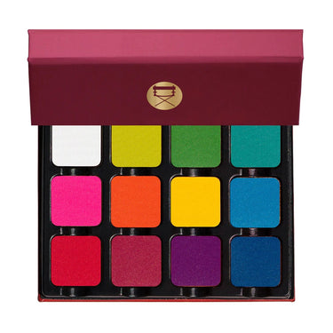
Shade 1: White — Bright white with a matte finish . Usage: The most versatile! This can be mixed with any of the other colors to create pastels or blended as a dull matte color.
Shade 2: Lime — Neon yellow green with a matte finish . Usage: This is a tertiary color, as it is a yellow-green, mix with white to make lime pale or with clover to intensify the depth of the green. This color is also analogous to both blue and yellow.
Shade 3: Kelly: Bright green with a matte finish. Use: This is a secondary color, mix it with white to get a pale green, with yellow to get a lighter green, or with blue to get a teal.
Shade 4: Aqua — Bright aqua with a matte finish . Use: This is a tertiary color, it is a blue-green. Mix with white to create anything from pastel teal to turquoise.
Shade 5: Pink — Bright fuchsia pink with a matte finish. Use: A tertiary color, mix it with white to create anything from pastel to bubblegum pink, or use it to brighten up blue and green eyes. This can also be used on the cheeks or mixed with too light a blush to intensify it. *WARNING* - This shade contains pigments that the FDA has determined are unsafe for use in the eye area.
Shade 6: Orange — Primary orange with a matte finish. Usage: A secondary color, mixed with white to create anything from pale orange to pastel. Orange looks great against blue eyes, or use analogous colors with it, like red and yellow. *WARNING* - This shade contains pigments that the FDA has determined are unsafe for use in the eye area.
Shade 7: Yellow: Primary yellow with a matte finish. Usage: Yellow is a primary color, making it ultra versatile. Mix with white to create anything from pastel to ranunculus! You can also blend with orange to intensify the yellow or blend with red to change the depth of the orange.
Shade 8: Periwinkle — Cyan blue with a matte finish. Usage: A tertiary color, mix with white to vary from pastel to light blue or use with similar colors such as purple or green.
Shade 9: Red — Neon red with a matte finish. Use: One primary color, mix it with white to create more shades of pink, or blend it to create purples, browns, oranges and more. *WARNING* - This shade contains pigments that the FDA has determined are unsafe for use in the eye area.
Shade 10: Raspberry — Bright raspberry with a matte finish. Usage: This is a tertiary color, it is a red-violet. It's great against brown or hazel eyes to highlight, but it's a super versatile color with almost any eye shade. *WARNING* - This shade contains pigments that the FDA has determined are unsafe for use in the eye area.
Shade 11: Grape: Bright magenta purple with a matte finish. Usage: This secondary color can be turned into a pastel by simply mixing it with white. This is also super versatile for any eye color to enhance. *WARNING* - This shade contains pigments that the FDA has determined are unsafe for use in the eye area.
Shade 12: Light Blue — Cerulean blue with a matte finish. Use: This is a primary blue, mix it with white to create a pastel blue or use it dramatically for anything you can think of. This can be used for lining, lid, fold - the sky is the limit. Blue is also a wonderful color to brighten brown and hazel eyes.
products.product.pickup_availability.unavailable
Product information
F.A.Q.
They appreciate cut and details, things that aren't so obvious.
AVETE UNO STORE IN ITALIA?
I nostri magazzini sono a Roma e li è disponibile un piccolo showroom dove poter testare la maggior parte die prodotti ed acquistarli. Disponibile solo su appuntamento.
Sono un professionista, ho diritto ad uno sconto?
Si certo, visita la nostra pagina dedicata per scoprire come richiedere la Pro Card.
Metodi di pagamento
Sul nostro sito potete pagare con carta di credito , bancomat, paypall, bonifico bancario oppure in contrassegno.
TEMPI DI SPEDIZIONE
Gli ordini vengono evasi in 24-48 ore dalla loro ricezione dal Lun-Ven.
Appena l'ordine viene evaso riceverete un'email con il numero di spedizione per poter seguire l'arrivo del vostro ordine.
Dov'e il mio pacco?
Dopo l'avvenuta spedizione del tuo ordine sarai contattato direttamente dal corriere con il tuo tracking code. Se non hai ricevuto il tuo pacco entro 7 giorni dalla nostra conferma di evasione,contattaci qui specificando il numero di ordine.
Posso modificare un'ordine già inviato?
Gli ordini possono essere modificati solo se non ancora spediti. Contattaci qui specificando il numero dell'ordine e le modifiche che desideri effettuare.
Come posso fare un reso
Puoi effettuare un reso entro 14 giorni dalla ricezione del tuo ordine, inviando il prodotto ancora sigillato unitamente allo scontrino fiscale nel pacco orginale e accuratamente imballato seguendo le istruzioni che troverai nella sezione Resi e Rimborsi


